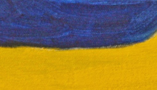
Here is a section of my painting with just yellow and blue. There is nothing that links the colors together, save the bit of green where the paints mixed a bit. There is no relationship.
This next picture shows the whole painting. Even though the colors still have no relationship to each other, there is a strong light/dark design.

This use of Notan makes the design better than the first image because it is interesting. The light value (yellow) is well balanced with the dark value (blue). There is flow, too.
This design can be made even more interesting by modifying one of the colors. In this case, I added some blue and red to the yellow to create a yellow ochre. The yellow sections now have both a primary yellow and a yellow ochre.

Because a garden has lots of green, the problem with primaries is lessened. The green removes the monotony of the primary color scheme because it links the primaries.
The yellow ochre in the last picture bridges the primary yellow and the primary blue. It helps your eye make sense of the picture because it creates a relationship between the primary hues.
The primary blue was also changed. Whenever you are dealing with color, decide what the dominant color is going to be. I chose yellow. I subordinated the blue to the yellow by giving it some "yellow" qualities. The blue now has a faint green quality to it (without actually being green).
No comments:
Post a Comment